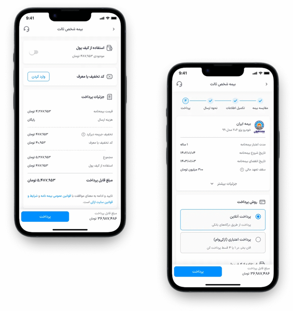
Checkout Page Optimization

Project Overview:
Context:
Azki is the leading insurance aggregator in Iran.
We help users compare prices, understand what they buy, and complete insurance fully online.
Story:
This is the final step before paying for insurance. Any confusion → users drop. Because payment happens on a separate government gateway, users must fully trust this step. But users were confused about wallet, discounts, and invoice — and many did not continue.
My Role:
Product Designer — End-to-End (Research, UX, UI, Data, Testing, Handoff)
Platform:
Web + Mobile Web
Timeline:
3 months (Design 1.5 — Development 1.5)
Team:
PM, Dev Team, QA, EDM, Data Analyst, UX Writer, Visual Designer, Design System Manager
User Segment:
All users buying any insurance on Azki
Business Goals:
– Increase conversion
– Reduce time on page
– Reduce dead clicks
Problem:
Users faced three core issues:
– Low understanding (unclear pricing and insurance info)
– Low confidence (UI and content confusion)
– High friction (technical blockers in the final step)
Constraints:
– Must follow current flow and APIs
– Design system limitations
– Technical restrictions
Research Methods:
– Analytics and funnel analysis (Google Analytics + Metabase)
– Heatmaps and dead click review (Microsoft Clarity)
– Customer support logs review (Chat + Call Center)
– Stakeholder interviews
– Competitor benchmarking
– Heuristic evaluation (Before redesign)
– Usability testing (Redesigned version — before launch)
Solution:
Clear content
Better structure
Better focus
Helpful info
No blockers
Better visuals
Simple payment
Outcome:
+9% Conversion Rate
-23% Time on Page
-16% Dead Clicks
Strong improvements in both business and user experience.
Private Case Study
This project is protected under NDA. Please email me if you’d like to request access

